Customer Data Platform (CDP)
It’s a comprehensive Customer Data Platform (CDP) for a better understanding of customer experiences to enhance customer lifetime value and make business marketing process more efficient.
UI/UX

Product Overview
Client: Various big company in Indonesia (business-to-business/B2B)
Industry: Feedloop.ai, B2B technology company
Timeline: around 2-3 years (since 2020)
My Role: UI/UX Designer
Tools: Figma, Notion
When joining Feedloop in 2020, I was assigned as one of UI/UX Designers in CDP. It’s a comprehensive Customer Data Platform (CDP) for a better understanding of customer experiences to enhance customer lifetime value and make business marketing process more efficient. It can track and analyze customer behavior then turn it into insightful analytics. CDP was a pioneer of CDP platform in Indonesia and it was needed by most of B2B companies in Indonesia.
I collaborated with the product manager, fellow designer and developers in order to measure the user’s requirement feasibility by giving input in user journey’s perspective or the cases in related to other features within CDP through meetings and async collaborations. After recurring discussions, it was decided that the main scopes of CDP are
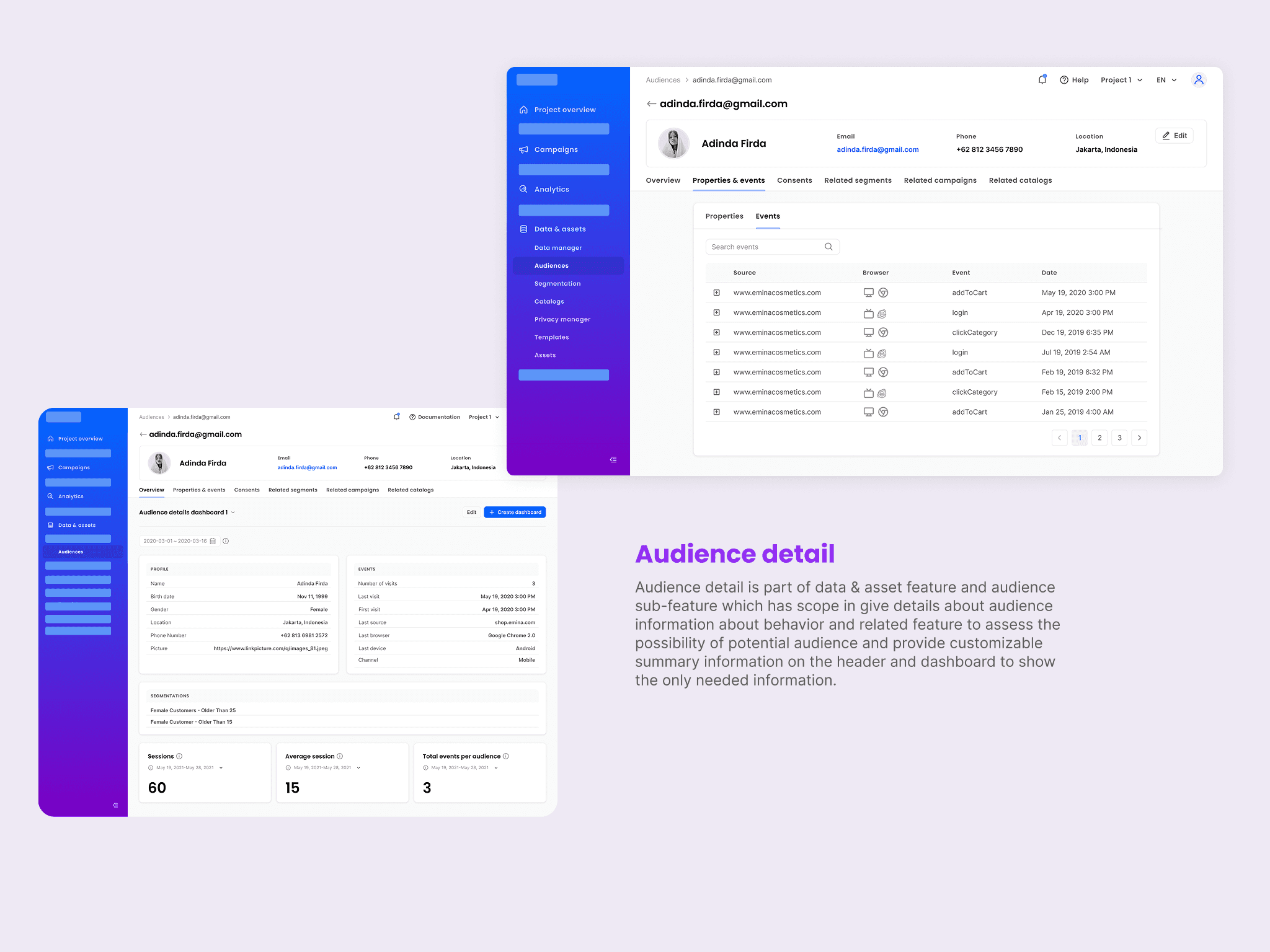
Capture: Capture and track audience behavior through integration and utilize it for marketing purposes
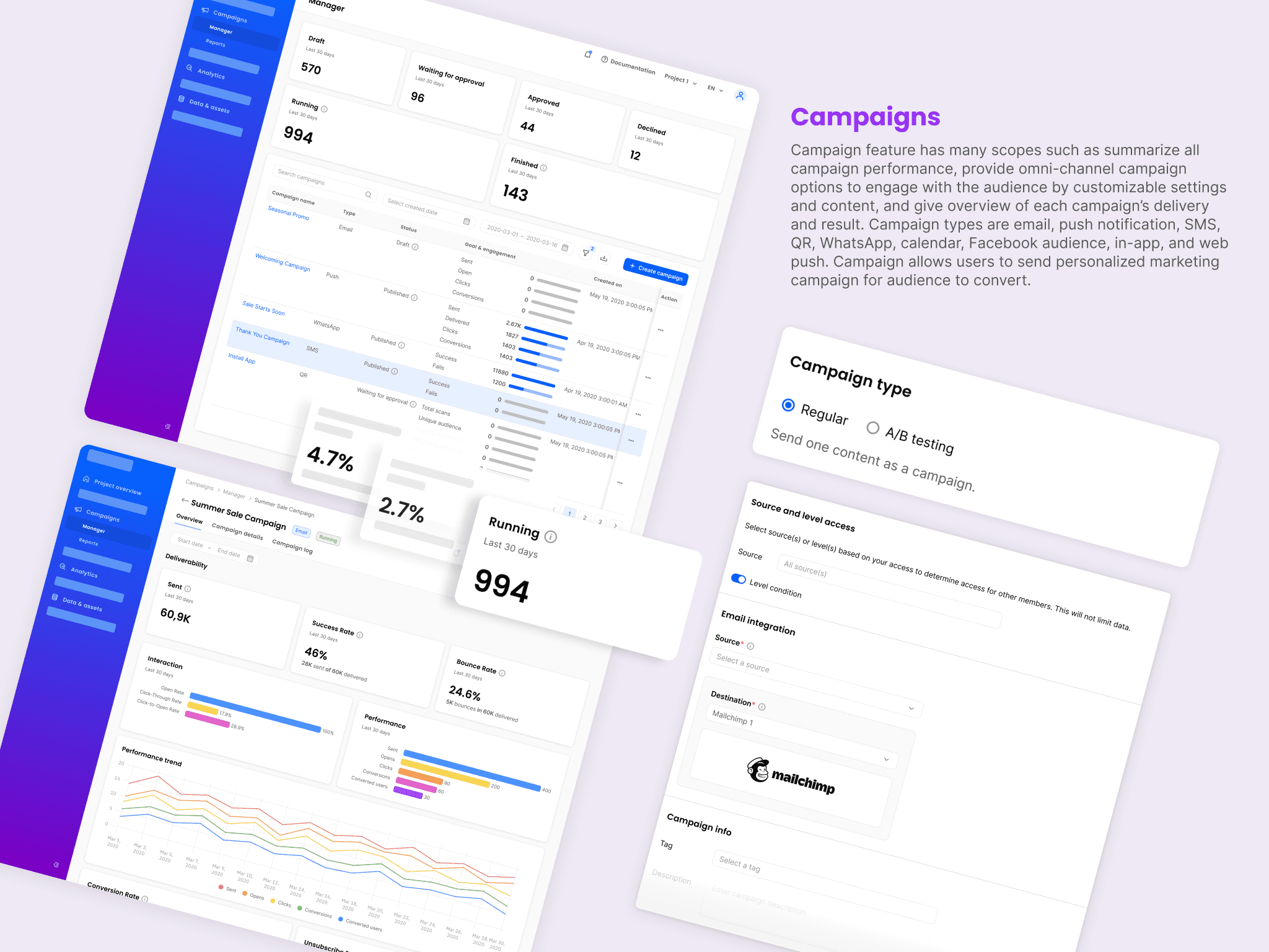
Campaign: Create omni channel campaign to engage with the audience with some customization for a better personalization
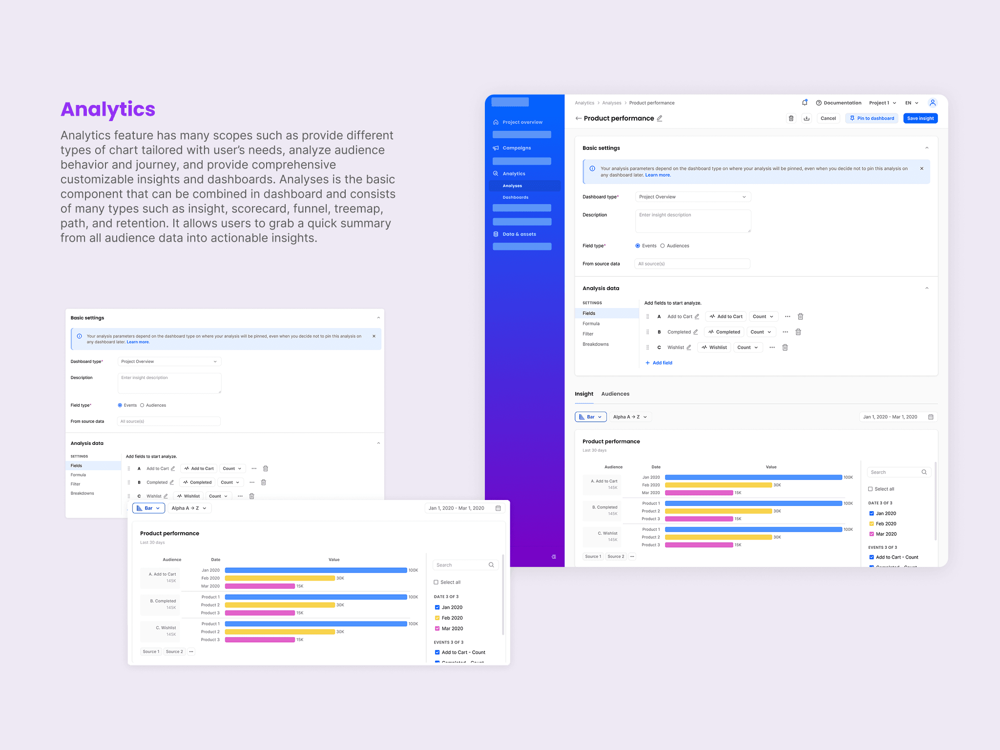
Insight: Analyze audience’s journey and activity by providing comprehensive customizable insights and dashboards
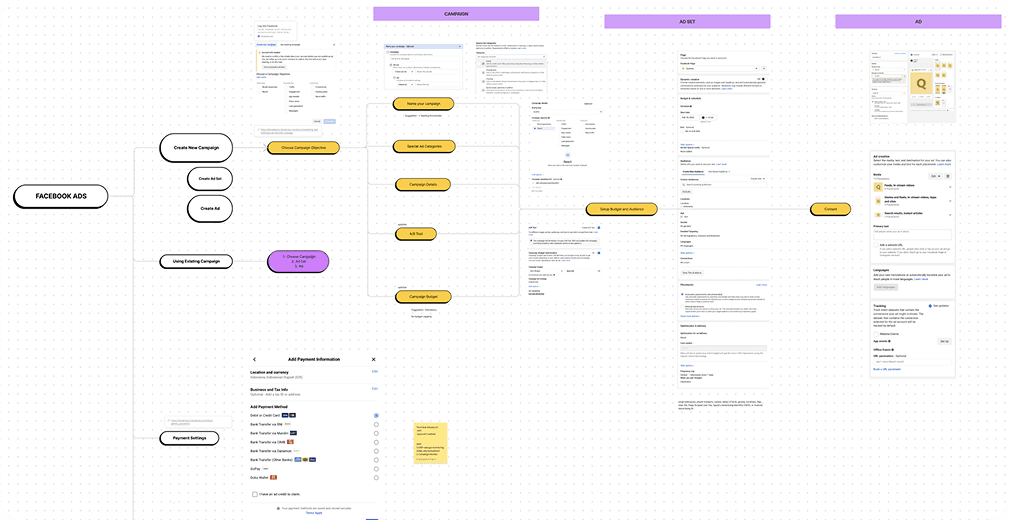
Requirements Concept
I concepted the approved requirements with product manager and other designers in terms of user journey in detailing flows, mapping the cases or reviewing information architecture using FigJam.
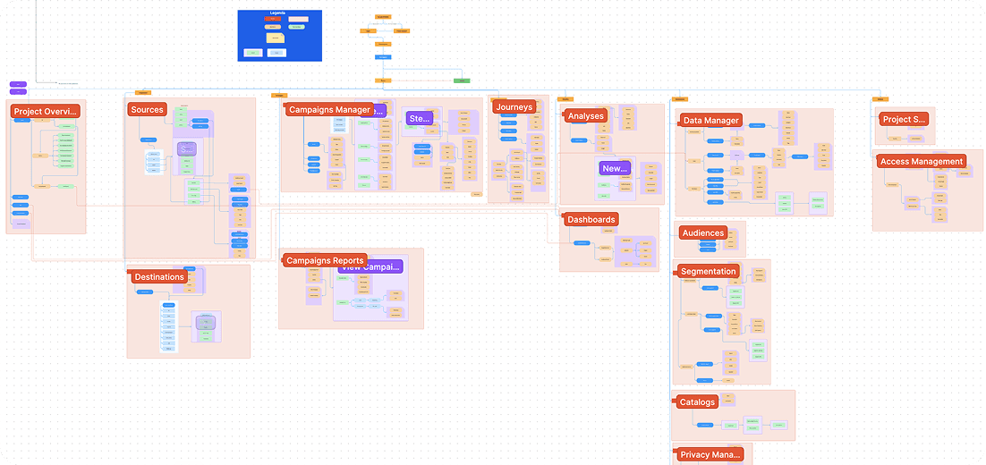
I made a diagram for CDP’s information architecture with product manager to help when placing features in context and navigation so that it’s easier to understand the product.
Design Styleguide
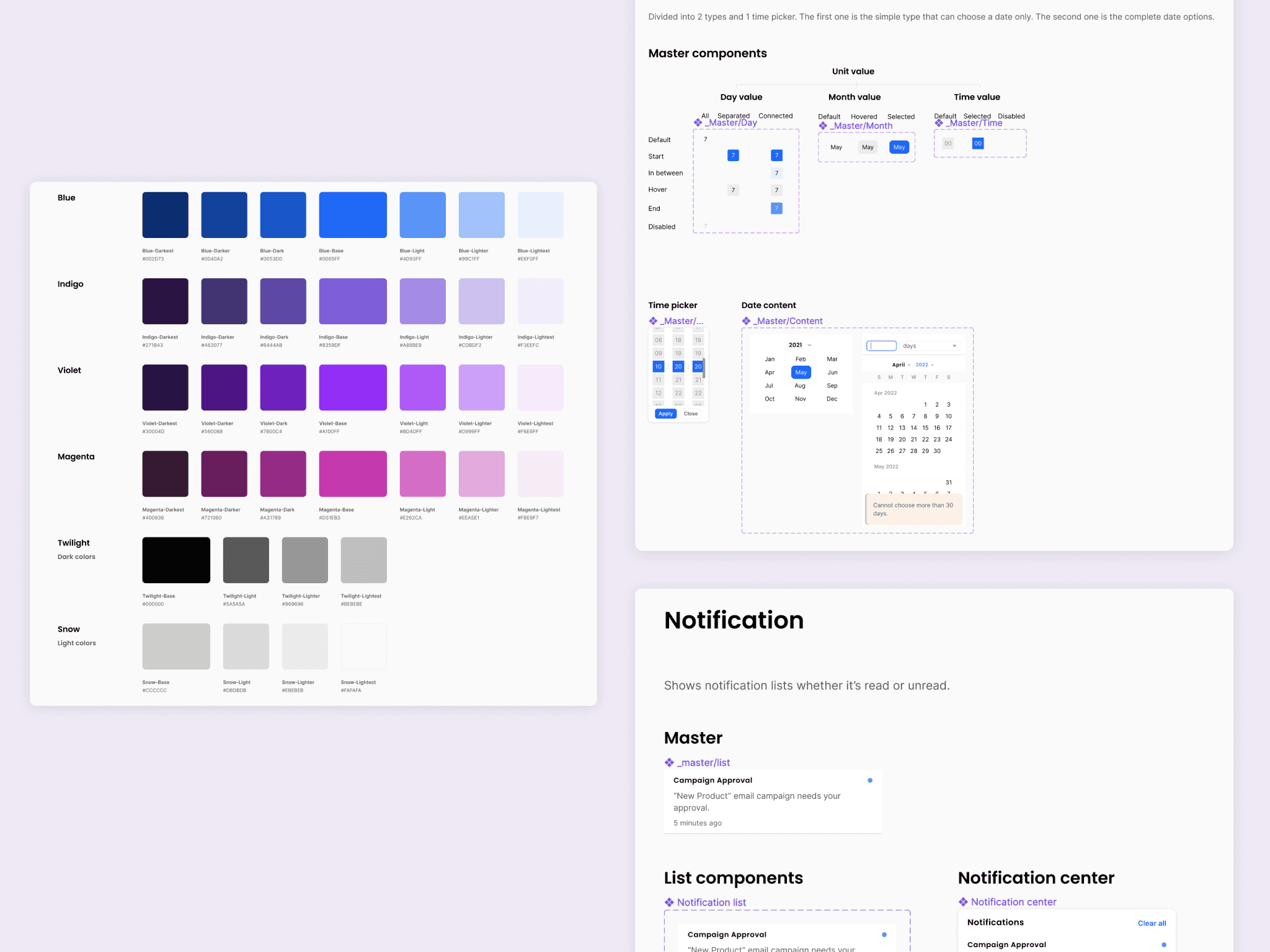
Before making the wireframes to show the flow, me and other fellow designer made design styleguide as a component foundation that can be reused in a many wireframes. There are two type of styleguide, such as the style itself (color, typography etc) and component (layout foundation that can be reused or switch based on variations defined). In this styleguide also provides documentation on how designer will use the component in many cases. It will help to maintain consistency for all components used in wireframes. Attached below are some examples of managing design system for styleguide.
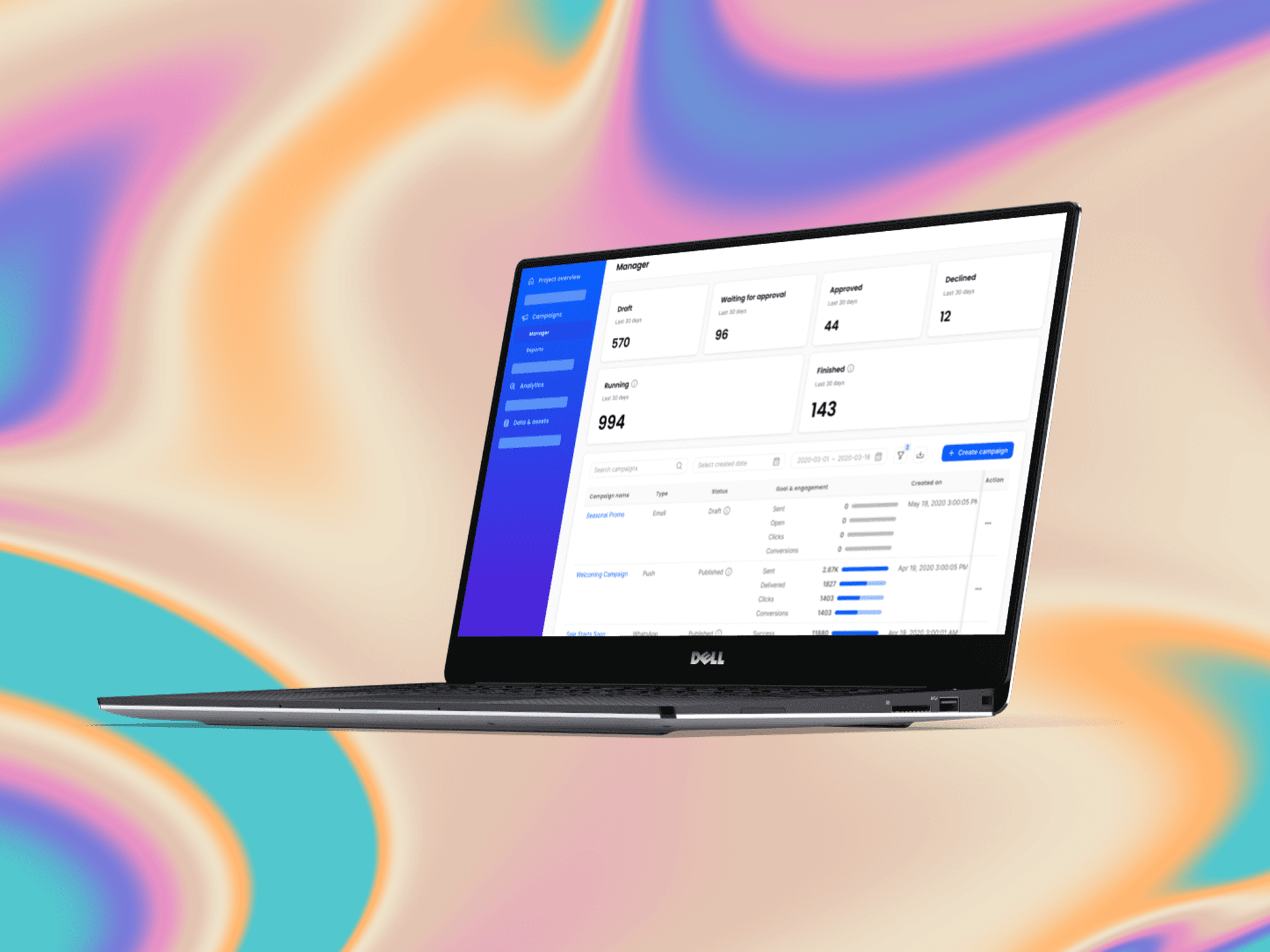
Design Solution
After gathering all requirement details and ideas, I implement them by creating high fidelity wireframes and some prototypes in Figma. The product team use agile development and limited time so that designers must develop high fidelity design immediately after concepted user journey and design layout for each main features.
Limitation and challenges
Did not have time to do usability testing directly to our user (clients)
Rarely implement UX audit then considering it for feature improvement
Challenging for us to decide which requirement that really matters to the MVP
Must think out of the box, sometimes it is hard to generalize those specific requirements into a feature
Reflection and room for improvements
I learned so much from working with the team to develop AIXP. It was challenging to map client’s needs to a high fidelity wireframes. Many collaborations with stakeholders (design colleagues, PM, and engineers) done to aim the best result for AIXP. To address room for improvements, we could:
Conduct usability testing before implemented to the clients by design team.
Balance between implementing new feature and auditing existing feature because sometimes problem from new features are from the existing.
Recheck the possibility of interconnection between features. Sometimes we can make shortcuts from other features that create a more effective flow and less painful for users.